Sample Histogram
The Task
Construct a histogram of the measurements in the table below.
Table: Various Store Prices for selected DVDs
| Title |
Price |
|
Title |
Price |
| Moulin Rouge |
$23.85 |
|
Back in U.S. Live |
$20.05 |
|
$15.07 |
|
|
$17.87 |
|
$24.89 |
|
|
$17.49 |
|
$19.40 |
|
|
$19.99 |
| Grease |
$21.15 |
|
Wizard of Oz |
$20.52 |
|
$15.74 |
|
|
$15.88 |
|
$19.74 |
|
|
$19.98 |
|
$22.10 |
|
|
$20.29 |
|
$17.22 |
|
|
$17.99 |
|
$20.74 |
|
|
$18.34 |
| Sound of Music |
$18.00 |
|
|
$21.23 |
|
$23.99 |
|
|
$18.99 |
The sample histogram below illustrates how the frequency of the data is related to one variable, in this case: price. Later more elaborate graphs will look for patterns comparing two or more variables.
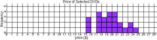
- Every histogram should have a title.
- Each axis should be labelled with (1) the property, (2) the units in (parentheses), and be numbered with (3) a scale.
- The scale difference from one division to the next must be uniform. The price scale increases by $1 per division and the frequency scale increases by 1 price per division, but other uniform, appropriate quantities would be acceptable. For example, the bin size could have been increased by 10¢, $0.50, or $5 per division, but not on the same graph.
- The numbers match the bin boundary lines, NOT the bin space. That way values in between (such as $19.74) belong in a bin (between the $19 and $20 boundaries).
- The number of stacked markers shows the number of measurements that fit in that bin. For example, there were four DVDs that had prices between $19 and $20.
Again, the purpose of a graph is to make apparent any patterns in the numbers. This graph shows that popular DVDs do not all sell for the same price. They range in price from $15 to $25 with the most common price, the mode, being about $20.